As I’m South African based I don’t shop on Amazon that frequently so its always interesting to look at how they manage their site. I know they do a lot of testing, in 2011 they were doing 7000 tests a year and the richest man in the world said:
“Our success at Amazon is a function of how many experiments we do per year, per month, per week, per day…” – Jeff Bezos, CEO at Amazon
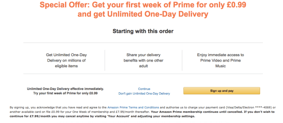
I’m always surprised at how aggressively they try and upgrade you to Prime. On my most recent purchase you can see the interstitial they used to try and upsell me. In order to not take the Prime offer I have to use an unobtrusive text link rather than the obvious yellow button.
I would be worried about all of this dark pattern Prime upselling on the customer experience. I think it’s a little sleazy and underhand but at the same time it doesn’t dissuade me from buying from Amazon (and if you have Prime you stick around forever, so its great for retention). If you look at the last time I purchased from Amazon and somehow signed up for Prime they had some strange ways to try and make me stay.
i inadvertantly just signed up for Amazon Prime (?!?) and they have some severe dark pattern processes on their unsubscribe process pic.twitter.com/BCNKdXXuCr
— Brendan McNulty (@brendanmc) October 1, 2018

Things I find notable about this:
- making people click “I do not want my benefits” to cancel
- making cancellation the least intuitive of four buttons on the page
- the phrase “Unlimited One-day delivery: Direct to your door” has so many great benefits
- Red vs green type (and the fact that its £0.00 not £0)
Finally here is a nice piece of UI from Amazon for products I’ve previously purchased. It messages that I last purchased it and when. Its easy and allows me to shortcut choosing my product, which at least for me reduced any choice friction and hastened my conversion.


One reply on “Amazon’s dark patterns (and a light one)”
[…] to an end and I wanted to cancel . As I went through their cancellation funnel I wanted to look for dark patterns and see if there was anything I could learn from what they had […]