As part of the Now Novel first user experience we are constantly testing the signup process. You’ll see our thinking from a few years ago here.
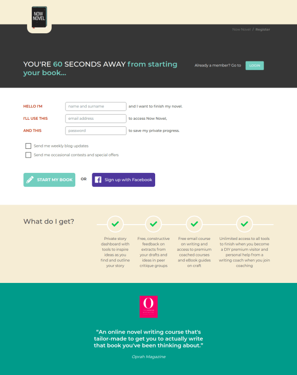
We arrived at the last version of our signup page through testing, but I thought it wasn’t great. There is a lot of explanatory content on the page, but its mostly superfluous and distracting. Rather than trying to funnel people into conversion it is doing the job that a page further up the funnel should be doing. It’s more like a landing page than a pure signup page. Don’t get me started on the FAQ that i think are actually causing doubt more than countering objections.

Looking at heatmaps we could see that people weren’t scrolling the page, there was a large amount of drop-off seen in GA and there were a lot of concerns about privacy and whether or not people had to pay that we got from analysing single question survey feedback.
In terms of evidence to change the page we used the following:
- Most people were coming from the homepage, so had an understanding of the service (which means that all of this additional information was superfluous).
- We have a lot of information about the benefits from paying users using long form surveys that we could incorporate on the page.
- We had jobs-to-be done research and understood what role we are employed for.
- Single question surveys and customer interviews gave us an idea about the concerns people had (concerns were mostly around their ability, cost and whether it would work).
This allowed us to put together a page that catered to countering objections, a headline that gives an expectation for the future on a short page.
The above version of the page we ran for a month and we had inconclusive results. The feedback from visitors that we got from single question surveys on the page was that they were worried about:
- whether they had to pay
- if they could trust the service
With our next incarnation of the page we iterated a little further.
We cleaned up the expectation around “What do I get?” a little, but the major change was that we added a large compelling testimonial to help give people reassurance that this was a trustworthy service.
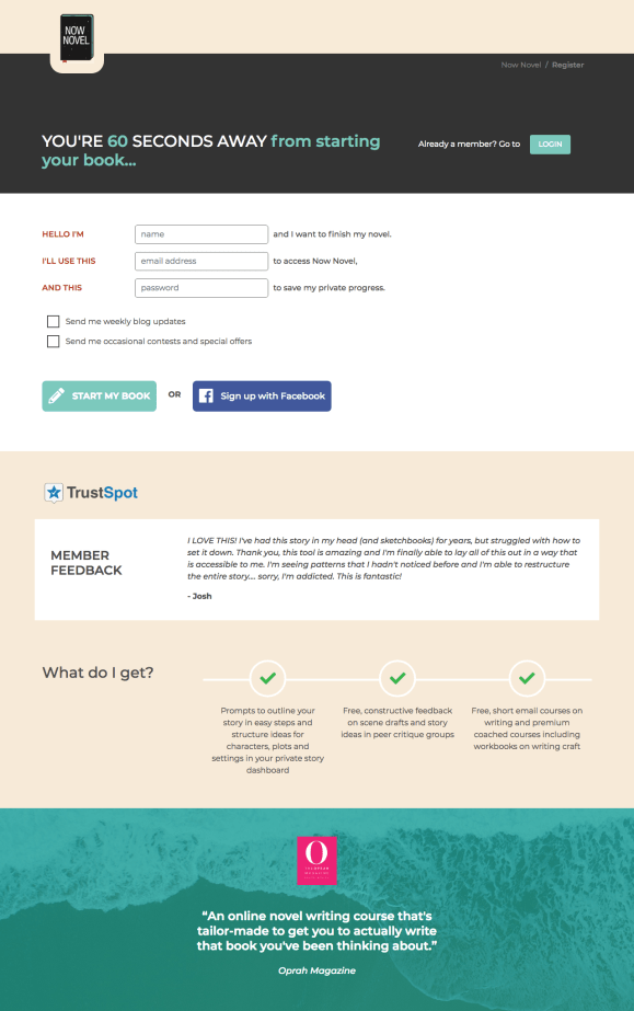
This test was a wholehearted success with a 14% increase in conversion at a 93% significance.
The major learning it gave us was that a strategic testimonial can give a lot more trust and increase conversion. We’ll be testing this in other areas of the site.
