My Headspace subscription was coming to an end and I wanted to cancel . As I went through their cancellation funnel I wanted to look for dark patterns and see if there was anything I could learn from what they had done.
Overall I thought it was OK, but I think trying to rescue a cancellation at this stage is hard work. Even if you do, without finding a method to fix why people were cancelling in the first place (through some sort of re-engagment/re-on-boarding) would be quite difficult.
Step 1:
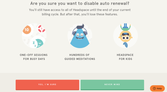
I thought this was pretty good, a good graphical representation of the features that they offer (having never used Headspace for kids I’m not sure why it got such a high placement, but maybe that is a key feature for most people). I am surprised that these are all feature driven, and not benefit focussed (I’d expect them to be focussing on improved concentration, reduced stress, better sleep etc). The green “Never mind” is a strange call to action, I’m not sure exactly what it should do/why that is the exit option.
Step 2
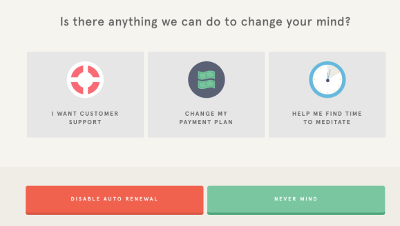
This is an interesting screen. “Changing your mind” is a good turn of phrase, especially in the context of what meditation can offer you. The first two (customer support and payment plan changes) are quite mundane.
Helping you find time to meditate is a great option. We find that it’s a key challenge for people wanting to write a book using Now Novel too. Self directed long projects are challenging for people to commit to. They don’t have an idea how long they’ll have to do it for (which is scary) and they’re unsure if they have the gumption to stick with it. In addition watching Netflix or scrolling Instagram is a lot easier after a day working. I would expect that this strategy would be better employed when onboarding rather than at this juncture. People have low motivation when they’re cancelling, so asking them to try and start a time saving process may be difficult.
I was thinking if I was looking at this first screen through a different lens how I might test a change. I have no user feedback so it would be entirely based on my perspective (so it probably would be 100% wrong :)).

I have put together a very rough wireframe.
Here are my thoughts:
- starting meditation can be hard, so reflecting that back to them and explaining that they’re not alone with the challenge can make them more receptive.
- Focussing on the benefits, not the features
- The marginal cost of one extra month for someone is so negligible in terms of cost, that you might as well try offering it
- Getting people to start onboarding (or speak to customer service) may resurrect them
- Putting in as much social proof as possible (60 million users, high ratings) may convince people that its them and not the service
- you could be sneaky and put the cancellation in a text link, hide it elsewhere or make the button text something like “I’ll quit please”, but I don’t think that kind of dark pattern UX helps you in the long run.
