I use the cart of website as a wishlist until I decide I want to buy something. This is a fairly widespread practise and something that came up in user interviews and usability testing for an apparel website I was working on. I also noticed that people came back and browsed and looked at new stuff but didn’t returning to the cart nor check out.
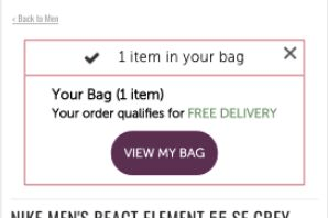
I wanted to see if reminding people of the product they’d found and added to the cart would motivate them to check out. You can see the sitewide (slightly personalised) message that I popped up for returning users in the ugly wireframe below. I also used the classic hook of “Free delivery” because no one ever wants to pay for delivery.
The results:
– a sizeable increase in conversion rate at 99% statistical significance
– a lot more people visiting the basket
In iterative tests I explored:
– adding product images (positive)
– changing design (positive)
– using click and collect instead of delivery messaging (negative)
An interesting test especially for apparel where you can show the image and get people sucked in
