Navigation is super interesting. It support browsing. If you don’t really know what you want it helps you understand the categories and sub-categories and drill down and view the range.
Two different pathways to find white Nikes on a store:
𝙉𝙖𝙫𝙞𝙜𝙖𝙩𝙞𝙤𝙣
(e.g. Mens>shoes> trainers> 𝘍𝘪𝘭𝘵𝘦𝘳𝘴 >Nike > white). It’s a much more exploratory experience and you’ll find lots of options as you go through the process (so maybe you’ll find a blue Adidas that is actually more alluring)
𝙎𝙚𝙖𝙧𝙘𝙝
Search is a focussed perspective when you know what you want.(e.g. 𝘚𝘦𝘢𝘳𝘤𝘩 White mens Nike). Quick and limited serendipity
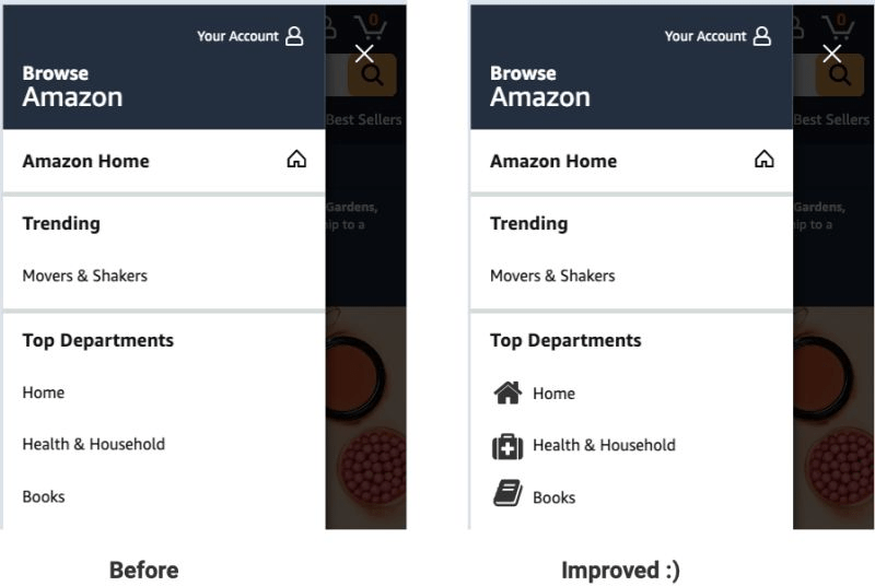
One of the patterns that has worked for me is trying to get more people to use navigation through making it easier to scan. 𝗚𝗿𝗮𝗽𝗵𝗶𝗰𝗮𝗹 𝗻𝗮𝘃𝗶𝗴𝗮𝘁𝗶𝗼𝗻 has many applications; using images/icons to explain categories, using graphic images for promos (especially if you’re using mega menus) or seasonally focussed graphic icons.
I’ve tested graphic elements to explain navigation (e.g. image of a t-shirt on a “tops” category) a couple of times and this has been a winning test for me.
Some insights from the tests I’ve run:
– Images work better than icons (it may work differently for you)
– the images encourage people to use the navigation more, this trickles down to product page visits and eventually conversion
– this is especially powerful for mobile (probably due to the smaller size and challenges in viewing)
When you’re next doing usability testing pay close attention to how people are using the navigation. If they’re struggling to use it this could make it clearer. In addition understand how important images are (usually pretty crucial for non-commodity items). If so, this may be a useful test for you.
(wireframe to illustrate)
