What if the key to e-commerce success is hidden in plain sight on the homepages and product pages of the leading online retailers? Your intrepid reporter (me :)) dug into the fastest-growing websites, as outlined by Similarweb, to pan for some insight gold.
Homepage
Value strips

I thought the USP strip was dead, but I was misled. They are prevalent on most of these sites; they are all about the delivery messaging, upfront on the homepage and letting you know when it’s free.
Popups

When I looked at the homepage, there were a lot of immediate popups. I thought that trend was over or not worth immediately asking for an email address without a relationship, but it is a pattern repeated on numerous sites (so it must work). I found the spinning wheel option much more alluring. It taps into the variable reward theory rather than just saying, take an X amount off; you can win something different.
Video
Only 17% had videos on the homepage, which seemed very effective. When I look at heat and scroll maps for homepages, they always seem to have the same pattern. People click on navigation or search to get the product they’re looking for or click on some above-the-fold navigation. They’re not interested in browsing; they’re there to do something, and this is the beginning of that journey. Most people never scroll below the fold. Having a video above the homepage is great for showcasing your product and differentiating it through demonstrating it (extra points if you go full height and width too; it gives it a more luxe feel)
Prominent value proposition

When I look at a homepage, I want the visitor to know three things:
- where I am
- why it’s different and
- what my next steps are
Only a quarter of the sites had clear value propositions outlining their differences. There was a lot of generic messaging.
Chat

There were a lot of opportunities for chat. Many people are trying to get you to communicate and interact further. Some of them have pre-selected/AI options, but sites want you to start some interaction, both on the homepage and on product pages.
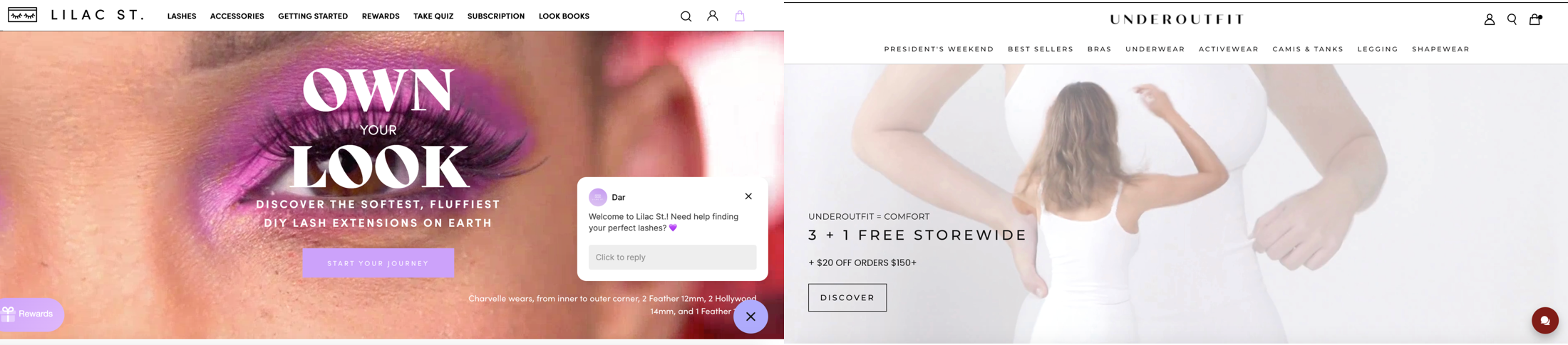
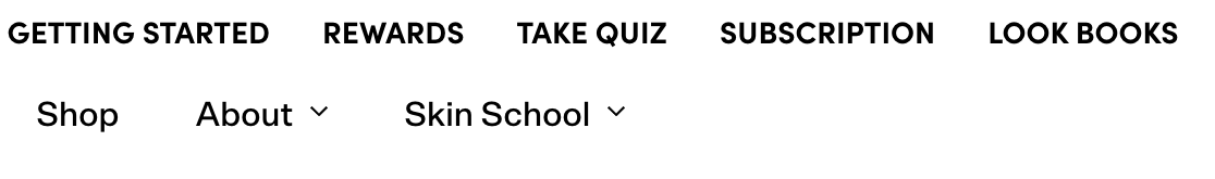
Navigation

Usually, navigation is focussed around the categories or products on sale. I’m not a massive fan of having “about” and “contact us” in the navigation, because they’re supplementary to the job of helping people find a product they want to buy. Because it’s DTC, you want to ensure that you differentiate yourself more effectively (and if you have a limited number of products, you don’t need a vast navigation). There were a couple of fascinating executions
– the opportunity to shop from Instagram.
– Showcasing the ad campaigns and telling the brand story
– as are subscriptions, lookbooks and “skin school.”
These were all great ways to get you to understand the differentiation behind a product.
Product pages
There were a lot of well-executed elements on the product pages. It could be more innovative, but there were some nice touches.
Value proposition
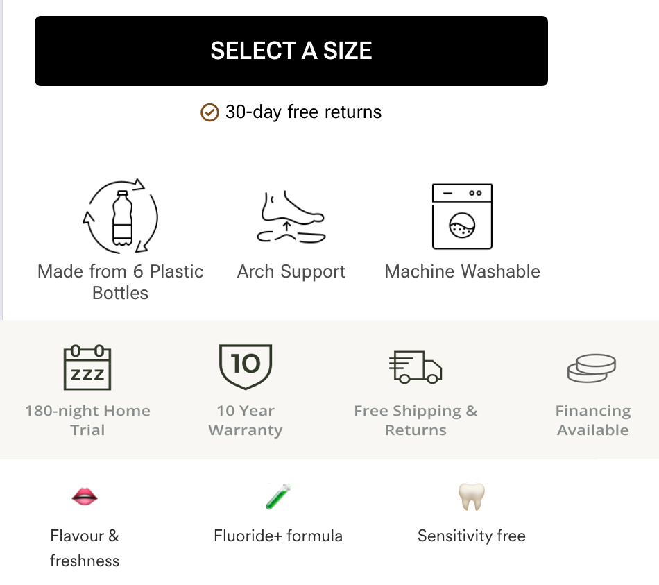
There was a lot of reinforcement of your value statements, from how they are made to why they’re different. This was primarily done with iconography with an overview of what it was about.
Upsells

Acquisition costs remain brutal, and next to improving your conversion rate, the other option to maximise revenue is through increasing your average order value. There were several exciting methods to do this:
- buy complementary products
- get more and different variants for a similar price
- get a subscription
(the bedding offer above had a little animation on the label, which called my attention to it)
Delivery
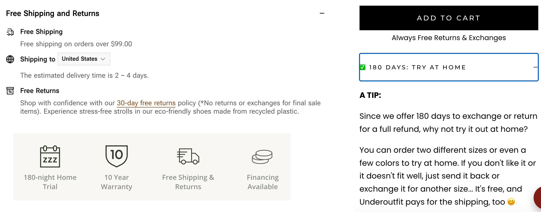
Very clear messaging around delivery;
outlining when shipping is free, when you can get it, and how returns work. I know it’s boring, but overcommunicating this stuff has a significant impact (I’ve tested this numerous times, and it works)
Product page structure
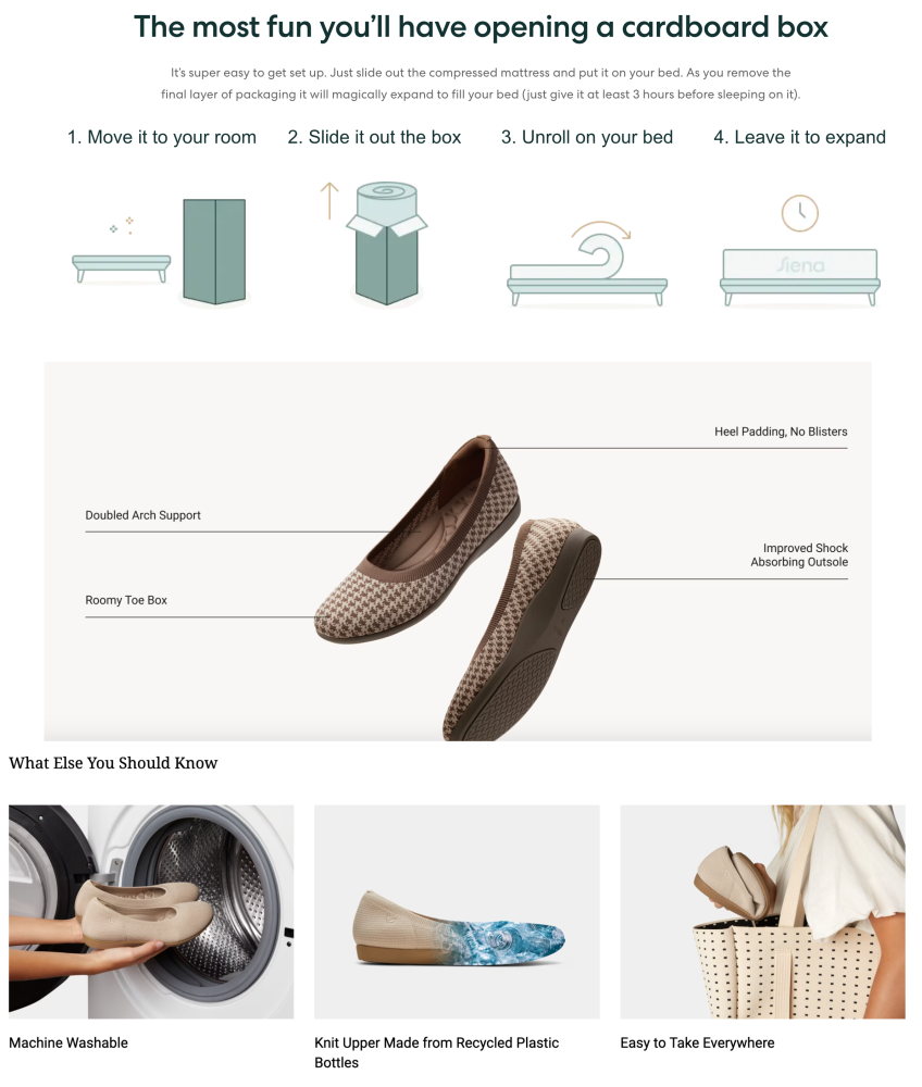
The general structure of the product pages is excellent. They have clear messaging and, below the fold, go into plenty of detail about how products were constructed. How it’s delivered, and information about product attributes. The way this is set up includes:
- product information with photos detailing aspects of the product
- video
- delivery information
- Frequently asked questions,
Risk reducers

Everyone wants to buy without worry, and many risk reducers are on these pages. From the initial subscription, where you only pay the shipping to 180 days returns(!!) on your product. These are all designed to get people to take that first step and then ideally be a customer for life (and allow the site to make up that acquisition cost in recurring revenue)
Get into the app

Users of an app tend to have better retention and more opportunity for communication. If you can get them into the app, it makes sense.
Comparison tools

I love comparison tools. It’s an excellent way for the site to communicate their differences upfront. If you control the criteria against which you measure the differences between you and your competitors, you can also accentuate the areas where you are better.
Communicating the intangible
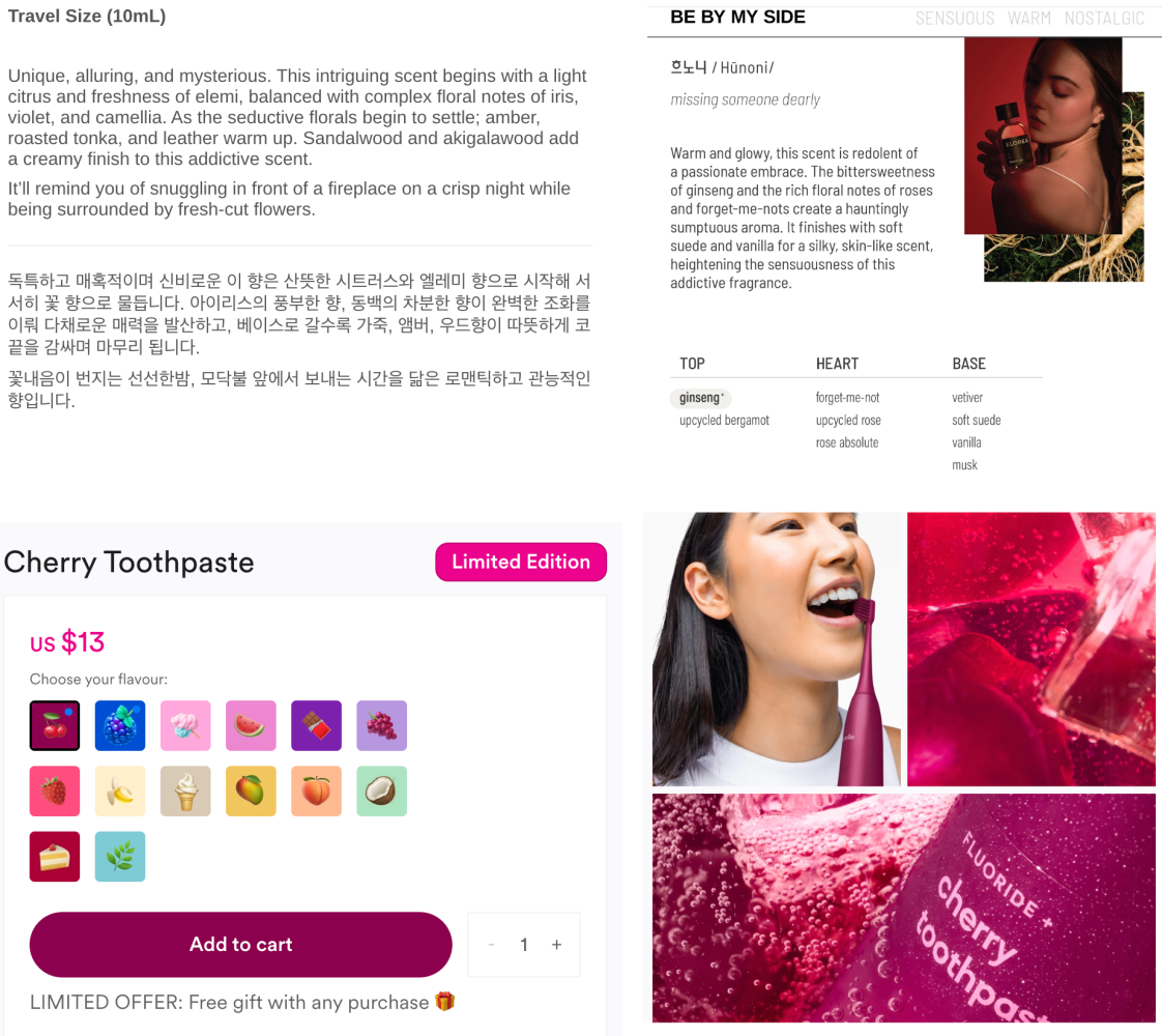
There is no smellavision, so it’s hard to communicate perfume or the taste of toothpaste online.
Can you communicate your toothpaste flavour through sassy emojis? The emojis combined with the freshness of the product images make me think that toothpaste will work.
Perfume is even more intangible to showcase. I like how they use imagery, words and copy to give a flavour of the fragrance. Also, reiterating the messaging in Korean tells me it’s exotic and the Korean is an intrinsic part of the product.
Innovative sizing
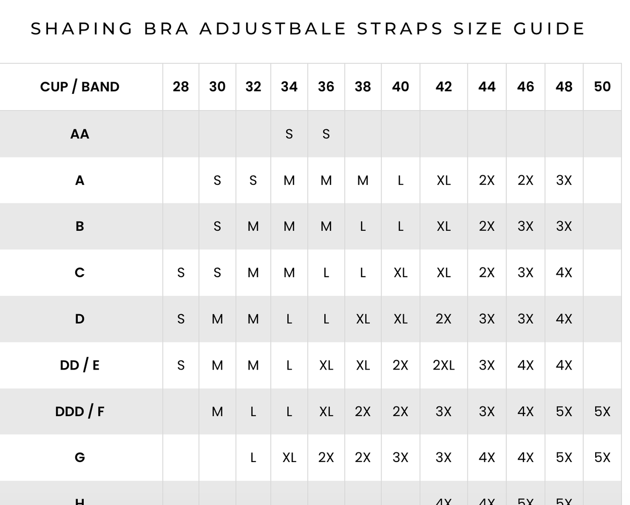
I’m going to do my level best to avoid mansplaining this. I’ve worked on selling bras online before and there are numerous sizes and cup sizes that make all the different stock and permutations challenging to manage. Making all sizes inbetween small and five XL makes it much easier for them to cater to a specific audience. Fewer SKU’s that they have to create and, in doing that, an ability to sell more and increase their opportunities
Three major themes come out of these fast-growing sites. These are the main principles:
1. Engagement
The use of immediate popups with rewards, chat, and homepage videos are tactics for engagement. How they’re implemented and how tired people are of the same executions is a matter for your experimentation programme 🙂
2. Navigation & UX
Steve Krug wrote “Don’t make me think” in 2000. Twenty-four years later, the importance of a transparent user experience with a compelling value proposition still holds—some innovative navigation options aid discovery in these examples and methods to simplify complex product selections.
3. Product presentation and trust
I was most impressed by the product pages; detailed information, FAQs, clear delivery information and extended return all help build trust and reinforce the value propositions. Continuous relevant upselling throughout the journey and comparison tools aid in educating the customer about the product and its benefits.
These perspectives reinforce the importance of engaging users right from their entry point on the website, providing an intuitive navigation experience, and building trust through expansive and informative product details.
