𝗧𝗵𝗲 𝗔𝗺𝗮𝘇𝗼𝗻 𝗵𝗼𝗺𝗲𝗽𝗮𝗴𝗲 𝘄𝗮𝘀 𝗱𝗶𝗿𝗲𝗰𝘁𝗶𝗼𝗻𝗮𝗹𝗹𝘆 𝘁𝗵𝗲 𝘀𝗮𝗺𝗲 𝗶𝗻 𝟭𝟵𝟵𝟵.
People weren’t as sophisticated in online shopping, but the underlying strategy was similar.
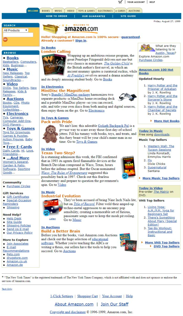
Comparing the two homepage versions 24 years on is enlightening. The usual homepage ecommerce pattern is that people don’t scroll below the fold. They click on navigation or search to get directly to their product. So what happens above the fold is the most important thing. I wanted to put my magnifying glass on this to understand what has changed.
𝗧𝗵𝗶𝗻𝗴𝘀 𝘁𝗵𝗮𝘁 𝗮𝗿𝗲 𝗱𝗶𝗳𝗳𝗲𝗿𝗲𝗻𝘁 𝗶𝗻 𝟭𝟵𝟵𝟵:
– Written content on the homepage, no product images
– prominent “how to order”, “site guide” and “our guarantee” and additional in-page reassurances. We don’t need that any more.
– Search is huge today, not as big then (but then it had a nice yellow box and a round button with weird orientation)
– A lot more deals in 2023. I’m not sure if that’s because it’s just past Black Friday, if people are poor, or if Amazon has more purchasing power- but in 1999 there was no mention of deals
– no personalisation in the olden days means that if I wasn’t in to or had read Harry Potter, I was still going to be recommended it
-the date is on the page in 1999
– all the unimportant stuff: help, recommendations etc is on the page and not in the footer in 1999
𝗧𝗵𝗶𝗻𝗴𝘀 𝘁𝗵𝗮𝘁 𝗮𝗿𝗲 𝘁𝗵𝗲 𝘀𝗮𝗺𝗲 𝗶𝗻 𝟭𝟵𝟵𝟵:
– an outline of categories and sub-categories (but in text rather than in images in 1999). This is a best practise so visitors can understand the breadth and depth of range.
– Bestsellers and recommendations are outlined.
𝗕𝗶𝗴 𝗰𝗵𝗮𝗻𝗴𝗲𝘀 𝗮𝗿𝗲 𝗮𝗿𝗼𝘂𝗻𝗱:
– images vs copy
– people know how to shop so all that stuff can be removed (and the date 😋 )
– Deals
– Personalisation
The 1995 version was a lot more archaic, some big movements in those four years. It’s interesting to know which principles stand the test of time so we know what is important and we should keep using.

